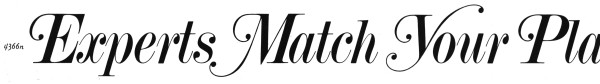
The core of this titling is Torino, a didone serif that goes back to the early 20th century. In the 1950s–80s many phototype companies, such as Photo-Lettering, added swash alternates. I don’t see exact matches in the two phototype variants I’ve checked (PLINC and Castcraft), so it could also be hand lettered or adjusted from a sample of Torino, as was common at the time.
For a digital font in this style see Torino Display JF.
Upon closer inspection, given how close the lowercase is to Photo-Lettering’s Torino Italic Swash, I think that’s what is used here, with custom caps, or caps not that just aren’t shown in this specimen.
Ok, found another sample, this time in Alphabet Thesaurus, Vol. 3, which pretty much confirms it for me. See the Y and P.
And here’s a Fonts In Use entry. Thanks for the inspiration, Javi!