Nice question, pookeyblow! For the first two images, check these out…
Various versions of Koch-Antiqua:


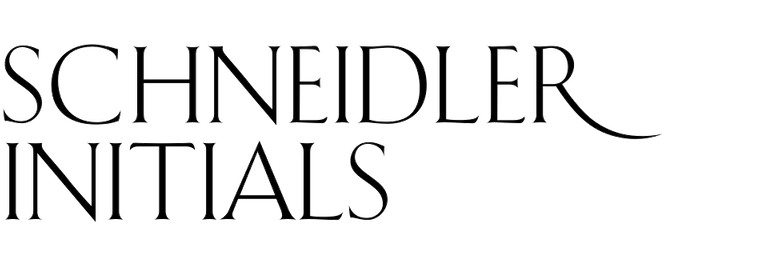
Schneidler was Neugebauer’s contemporary and they had some ideas in common:

(A text typeface that is similar in style to that lettering, but no digital version.)

(Reissued as Palatino nova Titling)

(Based on Ehmcke-Antiqua)
Your last image is slightly different, more directly calligraphic. See…


But the typeface that probably captures this spirit more than any other is the fairly new Frauen Roman, which was actually based on Neugebauer lettering.
